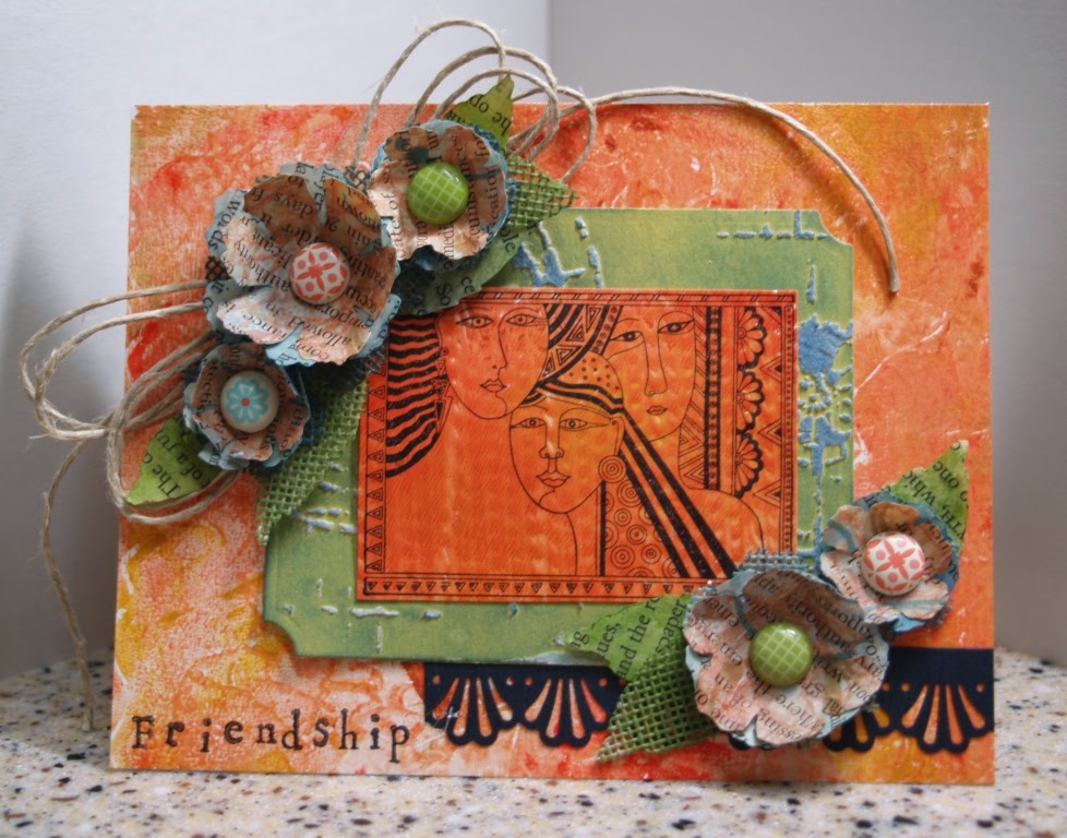
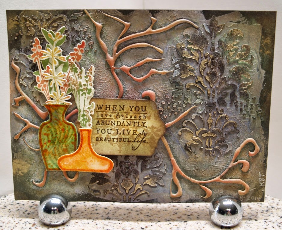
 I started by spreading white gesso on a piece of mixed media paper with a palette knife but I didn't cover the whole page. While the gesso was still wet I pressed into it randomly with an old rubber stamp. Next came embossing paste through a Damask stencil from UmWow Studio followed by random swirls of hot glue that were sponged with gesso once cooled.
Now that all the base texture was done I sprayed the page with Dylusions in Chopped Pesto and Slate Grey. I added poofs of PearlEx in Gold and Interference Green as I was spraying so the Dylutions would spread the powder and act as a fixative.
Once everything was dry I added Colorbox Chalk Inks from the Autumn Collection to the gessoed hot glue. Unfortunately it looks like a scene from "The War of the Worlds". I hid most of it by stamping and cutting 2 vases from some scraps of monoprinted paper using stamps and matching dies from Papertrey Ink then coating them with 2 layers of UTEE. The flowers were stamped with PTI's Larger Than Life set and die cut. The label was cut with a die from StampinUp's Chalk Talk set, stamped with PTI's Damask Designs then aged with Distress Inks. The sentiment from PTI's Meadow Greens set was stamped with Walnut Distress Ink and embossed with clear powder. The label and vases were mounted over the hot glue disaster with foam tape.
Til next time...